How to evaluate your email mistakes so that you can use that information to become a better email marketer.
At some point, everyone sends a bad email, whether that’s an email with clunky design or mistakes or image issues, and some of these email mistakes can be embarrassing at the least. But look at the bright side: there’s good that can come from carefully examining email mistakes. What doesn’t kill you makes you stronger, right? Same goes for making mistakes. By learning from the email marketing mistakes you make, you’re actually paving the way to email marketing success.
Let’s examine some of the most costly email mistakes we make and how to rebound from them:
Lack of Accurate Customer Data
You worked so hard to build your customer base, so it’s important not to neglect them. Both your business and your customers are constantly evolving, and with that, your customer information will change as well. You don’t want to alarm or annoy your customers with inaccurate or out-of-date messaging, so it’s extremely important to examine your data frequently to foster your customers’ longevity.
Always check to see if the people you have listed are even still your customers. And, for those who are still customers, make sure you have them categorized in the correct list segments to ensure your customers’ engagement stays intact. This is a critical data point to verify if you do targeted or dynamic emails.
This data update and verification should be an established part of your messaging process, so make sure to check this information every time before sending out a new email. Better yet, connect your marketing automation platform to your CRM system for always up-to-date information.
Emails That Are 100% Image
There are countless reasons why you should avoid sending image-only emails. They generate high spam complaints, have high bounce rates, and have a negative impact on open rates, just to name a few. And, if you’re sending to a large number of Outlook users, your emails will render like this:
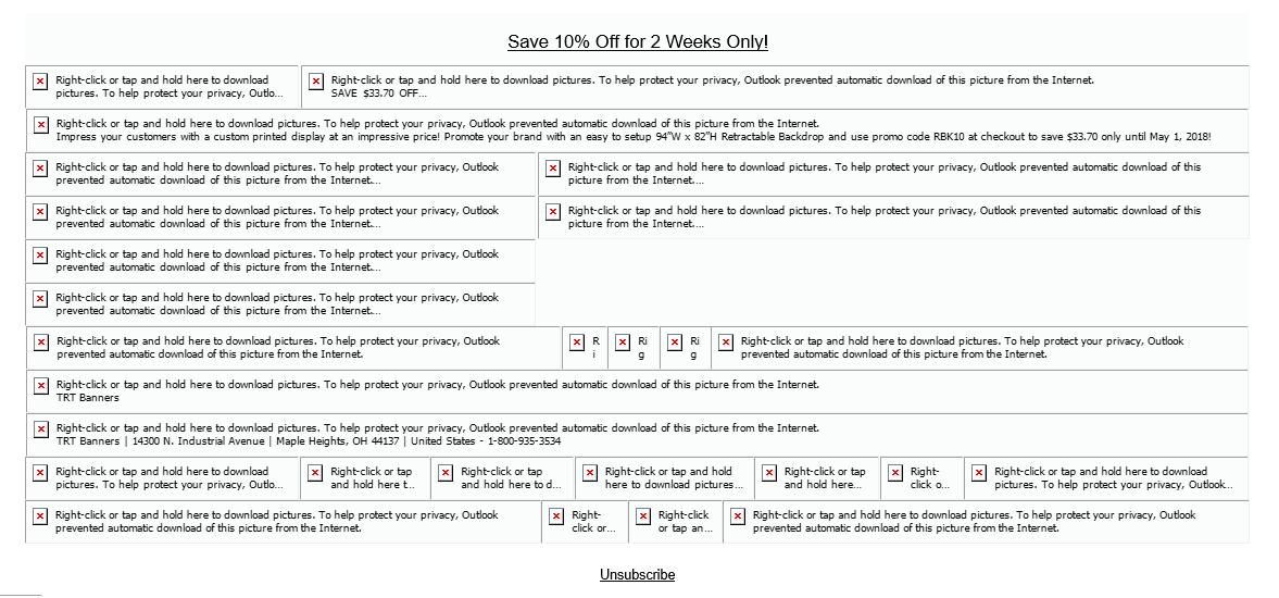
Ideally the best way to improve the likelihood that you’ll get into the inbox and be read is to upload the plain image (without all your text) and add the text to the body of the email. Some marketing automation platforms (like the emfluence Marketing Platform) have editors that let you drag, drop, and modify text on top of images.
Keep in mind that on the images you do include in your emails, alt text is crucial to helping email services that block images tell recipients what the image is, and using alt text also helps your emails stay ADA compliant.
The Design (or Lack Thereof)
Consumers today receive an average of 121 emails per day, so it’s easy for them to recognize a badly designed email when they see one. Also keep in mind, two-thirds or more of consumers are immediately trashing emails that look bad on mobile.
Why? These messages tend to look sketchy at first glance. And that first glance is crucial as most people are always on the go. Email readers will give your message only a few seconds to judge its value (assuming they even open it).
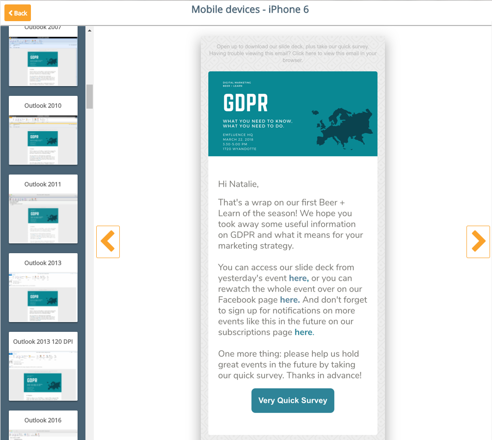
How to avoid this mistake? Make sure to add pre-flight checks to your email to do list before hitting the send button. For example, our platform allows you to pre-check your email in a number of email services before sending, like so:
Sending Incorrect Information (OOPS!)
We all make mistakes. And our initial action is to resolve that mistake with an apology. Most people think they need to send out an apology email right away, but depending on the error and your audience, you may want to wait. Sending too many emails at once, even for a mistake, can send your unsubscribe rate skyrocketing.
Before you do anything, take a moment to think about the mistake. A minor typo, misspelling or coding error probably won’t have much impact, other than some embarrassment or people pointing out the mistake, so sending out a follow-up could be an annoyance for your recipients. Instead, save the correction for the next email or newsletter that you send out.
On the other hand, a pricing error or the wrong date could have a major impact on your business or organization, so sending out a follow-up email right away is a must. Here’s a recent one from Lyft that directly addresses the previous email’s oops:
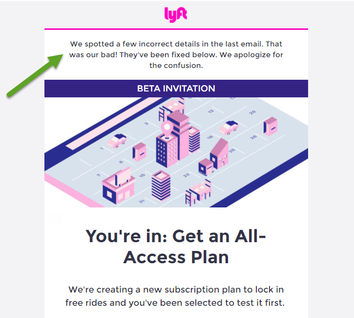
Once you’ve decided what your plan is and you’ve taken action, or not, look at how things went. The reporting from your emails will give you insight into how your recipients responded to the mistake.
So…the final piece of advice here is how to avoid a lot of these mistakes before you hit the send button…
Sending Without Testing!
Human error is common. It happens to the best of us. Which is why testing before sending is crucial to the overall performance of your emails.
First, let’s go back to the basics. Proofread, proofread, proofread. Place an approval on your emails that assigns other people to review the email and approve it before you’re allowed to hit the send button. Just one other set of eyes can prevent a mistake from happening again.
Next, always send a test email and check it! Make sure the copy makes sense, that you see the right images and they’re rendering correctly, and that all your links work. If you have variable content, use your marketing automation platform’s “preview” features to make sure you’ve got the right data populating the right fields, like so:
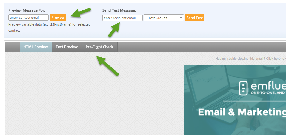
And finally, perform pre-flight and spam-filter checks on all of your drafted emails. The campaigns you design will always look a little different when they’re sent and viewed in your recipients’ inboxes. And different email clients and devices display HTML emails according to their individual rendering engines. Before you send an email, make sure to use pre-flight and spam-filter checks in order to avoid any costly errors. When performing these checks, you’ll receive real-time renderings of what your email will look like on the desktops and mobile devices of your recipients. This will ensure your recipients don’t immediately hit the “delete” button, as well as paving the way for higher open rates and deliverability rates.
Ahhhh…now you can finally put your email marketing stress to rest and get that 8 hours of sleep you’ve been longing for.
Want to get more email advice in your inbox each month? Sign up for our newsletters at more.emfluence.com/subscriptions.


