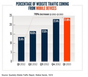
 As a digital marketer, I’m constantly barraged by article after article touting the benefits of mobile-optimized emails and websites in an increasingly on-the-go world. Screens are becoming smaller… and bigger, technology is improving and touch screen keyboards are easier for fingers to maneuver than ever before. The result? Nearly a quarter (24%) of total website traffic came from mobile devices in the first quarter of 2013—up 78% from the same time in 2012 and up 109% compared to 2011, according to a recent report from Walker Sands.
Many brand marketers have been working towards mobile solutions. Unfortunately, I see too many of my favorite non-profits and causes failing to take advantage of mobile…and falling behind. In the digital space, nonprofit organizations don’t have to be restricted by limited human resources. Specifically, in the mobile space, they have the chance to reach out and connect with their donors and stakeholders anywhere and anytime. What nonprofit organization wouldn’t want to jump on that bandwagon? A recent Chronicle study found: Online donations rose 14 percent last year from 2011, to $2.1-billion, according to online-fundraising processors Blackbaud, Network for Good, and PayPal.
Of course, a strong mobile website is key, but being mobile-optimized goes beyond that. Nonprofits need to send donors down a fully mobile-friendly avenue, especially to attract and keep millennials (those born between 1980 and 2000 or so). Millennials are your future donors and key to the sustainability of all cause efforts. Studies show that this generation will give time and money, but they want to do so on their terms. They want information on your cause through an easy-to-access medium that they can use when and where it’s convenient to them. The 2012 Millennial report found that: 65% of millennials use an organization’s website for information. Of these, 89% said they go first to the page that describes the nonprofit’s mission. To get the most of this donor group, nonprofits should make it as easy to get information or to donate as it is to send a text, for example. In a recent NPEngage article, Andrew Fort discussed the three things nonprofits have to keep in mind for a mobile-optimized site:
- Keep it quick: the longer that your site takes to load or it takes for them to “pinch and scroll” to find information, the more likely they are to bounce off without action.
- Keep it simple: when asking for donations / information from a user, stick to the basic information and only ask for what you need:
- Gift amount
- Donor’s name and email address
- Billing information
- Make it touch-friendly: the more your mobile website feels like a mobile app, the better a user will be able to navigate because they will be in the “mobile mindset.” Mostly, this means large (clumsy thumb-sized) buttons, a streamlined design, etc.
 One Kansas City cause that does a great job of creating a mobile-optimized donor experience is the ArtsKC Fund. In a recent cross-channel campaign, ArtsKC took mobile-optimized marketing to the next level, by incorporating a hashtag, QR codes and a mobile-optimized site. ArtsKC raised $14,559 in 14:55:09 hours during the Summer Solstice and over 70% was raised through ArtsKC’s mobile fundraising page.
If you’re like most nonprofit organizations, you don’t have a lot of extra time on your hands. Your mobile campaign should be easy to maintain and, better yet, easy for donors to navigate. Look for a “one-stop-shop” tool, like ArtsKC used. I’d recommend RĀZ Mobile (which is the service that ArtsKC used for their campaign). RĀZ gives marketers the opportunity to create a mobile-optimized website in a few quick steps (without an IT guy). They have a platform with built-in features to market to returning donors and to promote your cause or campaign via social media. Simple — and genius — tools like this give me hope that nonprofits can tap this powerful mobile world we live in and benefit from connecting with their supporters. As a millennial donor myself, I love that I can finally keep my favorite causes in my pocket and at my fingertips.
We have an increasingly growing audience accessing information and connecting in a mobile environment that fits their time. In this new digital world, donors are just a click away…how will you reach them?


