The core component of running a successful website in this day and age can be succinctly summarized in one word: content. This should come as no surprise to most of us, I mean who hasn’t heard the cliché “content is king” before? Now, I don’t mean to suggest this statement is untrue–I’d actually argue that it’s as true as it’s ever been–just that this emphasis on content can very easily evolve into an overemphasis on content, which can in turn overshadow other essential parts of a managing your site.
Over the past few months I have seen this exact issue on many of the websites that I’ve had an opportunity to work on, across some very different and unique industries. These clients got so caught up on cranking out the next piece of killer content that they skipped over an important detail: their clunky, poorly optimized, and often confusing navigation menus.
Why simplify your website navigation?
While a bad navigation bar won’t necessarily make or break your site, it certainly won’t do you any favors, especially when it comes to bounce rate and time on site. Think about it, how are users supposed to interact with your great content if they can’t even figure out how to find it? And why would they want to stick around if finding what they were looking for felt like looking for a needle in a haystack? You want users to enjoy their experience on your website, not loathe it, which is why developing a simple, condensed navigation menu is an absolute must for those wanting to find success in the digital marketplace.
How to simplify your website navigation
The first thing you need to consider when starting this process is whether or not you truly need every single page on your site. Figure out which pages and content pieces are the most critical for keeping your brand presence and message consistent across your entire site. Consolidate where possible and remove as many pages as you need to in order to trim your site down to its core elements. Basically, the philosophy here can be boiled down to one sentence: if your site’s visitors aren’t using it, you probably need to lose it.
Once you’ve trimmed your website down to its core elements, the next step in this process is to determine how you want to connect these elements, i.e., which pages are going to make up your navigation. A few things to think about are:
- How do these pages relate to each other? Do any of them fit within the same overarching category?
- What are your highest trafficked pages?
- Which of your pages drive the most conversions?
- What is the most important information for visitors to your site to see?
Try to find the happy medium between providing users with easy access to what they’re looking for and presenting them with valuable information and straightforward conversion opportunities. In most situations a good goal to aim for is five main navigation tabs with a single sub-menu column under each one, but obviously this solution is not one–size–fits–all and will differ on a case by case basis.
Different types of navigational menus
After deciding on your navigation bar layout, you’ll need to determine how it’s going to look and function from a design perspective. There are nearly endless possibilities here, so feel free to stretch your creative muscles, just keep in mind that there is such a thing as overengineering your menu. Nobody needs (or wants) a navigation bar with a million moving parts, so don’t waste your time creating one. Instead, focus first and foremost on providing an excellent user experience and you shouldn’t have any problems.
To help inspire and guide you in this step in the process, I’ve put together a list of some of the more common navigation menu styles below.
Top Down Navigation:
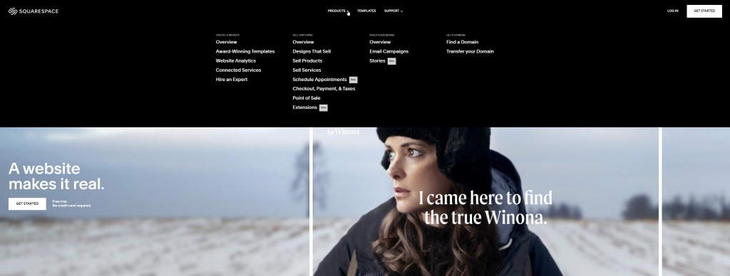
The first on the list is your standard top navigation menu with a few core choices and a breakdown of related sub-menus. This style is by far the most common across the internet, but that doesn’t mean it’s a bad choice. It’s familiar and intuitive to users, and although it isn’t particularly fancy functionality-wise, it can be enhanced by design!
One great example of how this style can be improved by design comes from the website building company, Squarespace.
Parallax Navigation:
Next on the list is the more unique but still common parallax menu style. This allows for more visual space and gives a creative photography style appearance to your site. The functionality mirrors that of a standard menu but can allow for jumping between pieces of content or sub-pages all within the same main page. It gives the user the ability to jump right to the content they want or scroll through and experience all that the site has to offer.
One of my favorite examples of parallax navigation comes from Cyclemon, an experimental website that fits somewhere between art portfolio and ecommerce.

In-page Content Block Navigation:
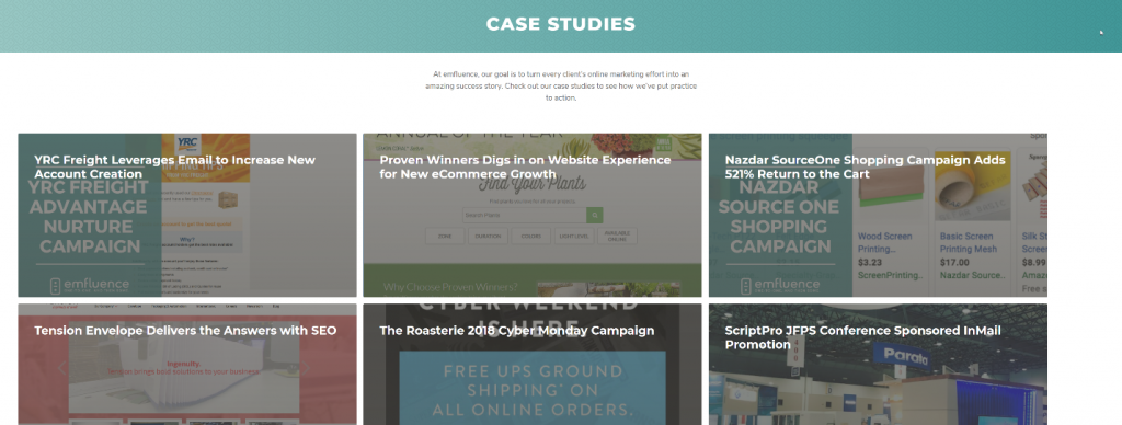
A little more complex than the first two is the in-page content block menu. This provides for an additional level of organization without cluttering up your main navigation menu. As an extra plus, this style is fantastic for organizing your client work by project, industry, time and whatever else you deem necessary.
We actually use this style in the case studies section of our site!
There are many more options for menu styles than the ones mentioned above, these are just some of the most common. If you’re interested in learning more, check out all our blogs on website design here!
Build it
The final step in this process is building your navigation menu. Hopefully you are at a company that employs some very talented developers to help you, or if not, have an agency that you work with on your marketing projects (I hear emfluence is a good one…). Either way, celebrate because the hard part is over. Having the vision and map of how you want your new menu to be structured is most of the battle, getting it done is just the icing on the cake.
Tips for navigation menu SEO
You now have a sleek and easy to navigate site menu, but that doesn’t mean your work is done just yet. As with any marketing project, you’ll have to collect data and make a few tweaks before you can truly consider it a job well done. Some tips I have are to:
- Make sure that you have Google Analytics (or another tracking program) set up and are actively checking on your site’s statistics, you’ll want to utilize these data-driven insights to guide future optimizations.
- If you end up redesigning and redirecting a core page on your site, don’t forget to redirect it in your navigation bar too! This is one of the most frequent search engine optimization goofs I see when it comes to site menus, and the ensuing redirect chains can add up to a bad user experience faster than you can say 301. Learn how to complete 301 redirect mapping here.
- Including a page in your main menu structure tells search engines that is a priority page. You value that page enough to link to it from, likely, every page on your site – so search engines should consider that valuable as well. If there is a page that you’d like to drive more traffic to and there is a relevant location in the menu structure – add it!
There are many ways you can structure your website navigation. As long as your principal focus is promoting a positive user experience for each user – you are ahead of the curve.
Need help with your website? Let’s talk! Send us an email at expert@emfluence.com or fill in the form below.