Last year, Gmail got email marketers all in a tizzy by introducing its new tabbed inbox. Now, Gmail is testing a new visual “grid” layout for emails in the Promotions tab that gives users a peek at the contents of the email without ever having to open it.
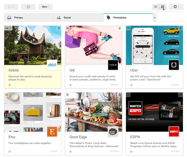
I signed up for the trial right away to begin testing things like how Gmail chooses which image to feature and what happens when an image isn’t big enough or isn’t specified.
Let’s first look at the Anatomy of a Single Email in this New Grid Layout:
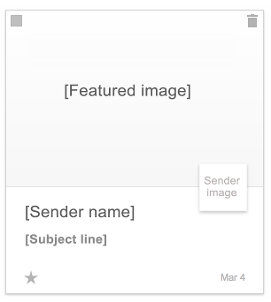
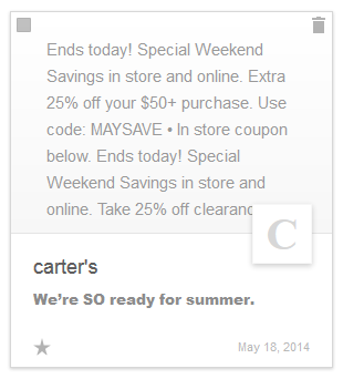
The standard sender name and subject line are still visible, but now are complemented by a sender image and topped off with a feature image for that email. Since Gmail is still testing this feature and it’s not widely used yet, most email marketers have not yet started implementing the additional code that specifies a featured image and sender image for an email. So right now, a lot of emails look like this one from Carter’s: Instead of a featured image, Gmail is pulling in a bit of text from the email. For the sender image, Gmail uses the first initial of their sender name. Clearly, that’s not as exciting as the Gap email next to it that pulls in their featured image and logo.
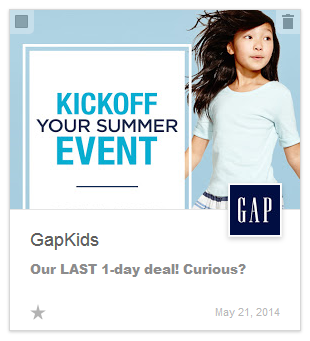
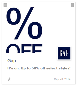 Even if you don’t set a featured image, Gmail will attempt to pull any image that’s at least 580x400px, which will then be sized down to fit in the 290x200px opening in your email. This may seem better than text-only, but Google doesn’t always pull the image you’d want. For example, in this email from the Gap, the featured image is a sliced piece of the main promo image. It would be much more enticing if I could at least see the full percentage off in the graphic layout.
To make things even more complex, your sender image is pulled from your company’s Google+ page. But, in order for it to be pulled in, your Google+ page must be certified and your email must have DKIM and SPF set up. (Read more about DKIM and SPF authentication in Jessica’s post here.)
The good news is: Gmail does allow you to choose your own featured image and sender image by adding in some additional code to your email. Our friends at Litmus have made this very nice tool that allows you to drop in your email information and it automatically creates the code for you. Then that code can be dropped into the source code of your email.
I have to admit: as a Gmail user, it is nice to quickly scan the images to decide which ones deserve my attention. But, it makes subject lines less effective. Now, I barely notice them and only read them if the image interests me.
As this gains in popularity (and my guess is that it will), I’d recommend that email marketers set a striking featured image and a subject line that complements the image.
If you’re interested in testing out the new Gmail grid layout, check out the trial sign-up page. I’m sure Gmail has plenty more changes in store. After all, they like to keep us email marketers on our toes.


