We email marketers love to jump on the hottest industry trends and tricks that could give our open and click-through rates the extra boost we’re looking for. Although the blogosphere may be buzzing about mobile-responsive templates or animations and video in email, the bottom line is – if your mobile-ready email is only being opened on desktops, or your recipient can’t even view your clever animated GIF because they use Outlook, then you’re not going to move the needle on your results.
If you want to optimize your email design to boost your open and click rates, you’ve got to know where and how your audience looks at your emails. Are they opening on desktop or mobile? Are they on a PC or a Mac? iPhone or Android? Outlook or Gmail? Or do most of your emails go to a company that still uses Thunderbird? (If that last one applies to you, I’m sorry.) Once you have a feel for how and where your audience reads email, then you can optimize your email content for them, specifically.
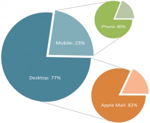
 We love when our clients prove best practices. Rush Wade 2 is a great example of marketers that understand and capitalize on their audience data. From their device reporting, we know that on average:
- 77% of their email recipients open their emails on a desktop
- 82% of desktop openers use Apple Mail (63% of their total opens!)
- 80% of mobile openers use an iPhone
Keep in mind that open rates for Apple devices will always be skewed, since they load images automatically. (Open rates are tallied based on images loading.) But skew aside, Rush Wade 2’s stats tell a significant story! Their readers tend to be designers and people in the ad agency world, so it’s no surprise, really, that Apple is a go-to.
Apple mail is one of the email clients that plays animated GIFs within the email. So, armed with information, Rush Wade 2 sent an email featuring a well-designed, prominent animated GIF as the hero image:
 |
 |
 |
For those who did open via Outlook, RW2 made sure the first frame of the animated GIF told the story well enough (since that’s all Outlook users would see in their inbox).
2013 may be the Year of Mobile, and videos/animations in emails are certainly gaining popularity; but before you jump on a new trendy bandwagon, take a close look at your device reporting. Unique email designs only work if your audience can see them!
For more inspiration and ideas on creating audience-friendly email designs, check out our post on Pinterest’s adaptive email layouts. Or tell us how you optimize your email designs for your audience in the comments below!


