Your Web Content: Working Hard or Working Smart?
A wise man once said, “Blogging does not a content marketer make.”
Actually, I just made that up… But here’s the point, you can blog and publish content regularly. However, if your site content isn’t converting website/blog readers into actual contacts – then what’s the point or value behind it?
Every marketer inevitably hits a content wall and bandwidth restrictions to keep churning out blog posts, social posts, infographics, videos, podcasts…you name it. The key is to keep the content and conversion wheels in motion, even while you’re not at the actual wheel creating it. Additional driving pun: you will still need to drive it, though.
Vroom Vroom, here’s six easy to integrate tactics that you can put into place today that will increase your conversion rates and turn visitors into subscribers and customers – freeing up your time and resources to focus on that next great piece of branded content.
1. Add Subscription Forms to Your Site
If people are reading a post on your blog, it’s likely that they’ll be interested in your future posts. Make it as easy for your audience as possible to read everything you post on your blog by creating a form to collect contact information and send your new posts out by email.
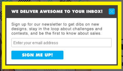
Just so you know: Email pop-ups are NOT a dirty word in the marketing game. Bottom line, they convert. According to ExactTarget, 77% of consumers prefer email over other channels. With subscription rates as high as 35% according to a Conversion XL study.
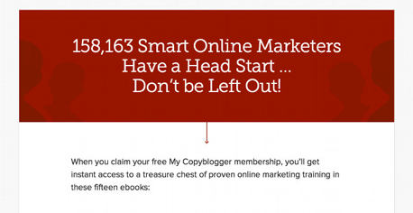
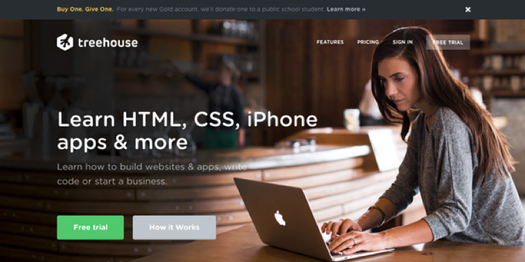
So, the question shouldn’t be: “Why should we do this?” The question is: “Why aren’t you doing it already?” Here are some examples of marketers doing it right.
Threadless
Copyblogger
Tastebook

2. Keeping Your Content Fresh
You have to post, you have to create and you have to curate your content. That’s not new news. It might seem trivial, but think about it in these terms:
Every week that goes by without a post is equal to lost readers. A reader is a potential customer.
If your company is not actively publishing unique content, then it’s more than acceptable to curate content from other thought leaders in the space. In the age of information overload, there is plenty of content that’s already been written (and is relevant to your messaging and audience.)
Anything industry related that YOU are reading on a daily basis is likely relevant to your audience. Moreover, if you found it insightful or learned something, then that is the exact type of content that your audience would want to see as well. Instead of just retweeting a link or sharing it on social – add your take and insights. This will help readers look at your brand or company as a thought-leader in the space, with a unique POV. This time-saver will allow you to hone in on creating original content without having to experience any “lag” in publishing on your content hubs.
3. Calling Out Your CTA’s
Whether you’re a small or medium sized business, the ultimate goal is to generate leads and sales. Content marketing is designed to engage your readers and establish a connection. But what comes after that if there’s no takeaway? (hint: they leave your site).
Be explicit in the actions that you want users to take on your website, blog, or social channels.
- Do you want email subscribers? – Click Subscribe to see more from us.
- Do you want awareness on social? – Click like or subscribe to our channel.
- Do you want engagement and conversation? – Tell us what you think in the comments.
- Do you want to continue to conversation with them? – Click here to download our whitepaper.
- Do you want to close the sale right there? – Click here for a demo or to speak with us.
4. Ask for Social Shares
As mentioned previously, you can be perfectly transparent with your readers in order to elicit the desired action. A little nudge can go a long way (be nice, I said nudge not PUSH!)
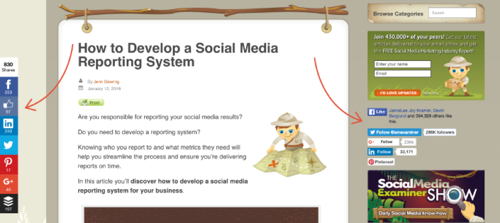
Place shareable buttons all over the place and test which ones perform the best. At the top of the post, under the heading and author. At the bottom of the article and on the sidebars. By placing easy to find follow/share buttons on every page, this doesn’t require readers to scroll up or down to share. Ugh, such a waste of milliseconds to scroll – First World Problems, amirite?
Don’t go completely nuts with your share buttons, though. Prominence ultimately matters more than the actual placement, and too many bells, whistles and buttons can negatively impact your site speed and thus SEO value.
Another consideration the value of what's called "social proof". Social proof is what validates the worthiness and value of your content. See those numbers next to share buttons? That can seriously help or hurt you from a reader's perspective. If your blog posts get tons of shares, then great, turn those suckers on and show it off a little. However, if you're not actively getting on-page shares, then consider turning them off. If a reader hits your page and sees one share across multiple social channels, then they will assume it's not worth their time to read through – even if is indeed a valuable piece of content.
Another tip for in article shareable options for your readers: Grab some of the juiciest nuggets from your posts blog posts and include a “Click to Tweet” link within the body of the post. Your visitors aren’t spending a ton of time on your site, so make it easy for them to get to the good stuff. More on that below.
 From: Coschedule: Social Media Button Placement
5. Help the Visitor Navigate Your Site
You have 15 seconds of your average site visitors time, according to Tony Haile of Chartbeat. Referral channels are irrelevant. FIFTEEN SECONDS makes up the average time spent on websites by 55% of your total site visitors.
Suffice it to say, that’s not a lot of time to get visitors to read an entire blog post, browse other content and sign-up for an email. You may not be able to drastically increase this time on site, and odds are that you won’t be able to overnight. But there are ways to increase WHAT the site visitor does in those precious seconds you have.
- Increase the visibility of related content, based on where they landed.
- Grab that email with a strong call-to-action and value-exchange, quick!
- Put your best stuff above the fold – over 50% of your traffic is coming from tablet & mobile, so keep that in mind when designing your landing pages. 80% of web users spend their tie looking at information in this area of your site, according to QuickSprout.
- Embrace the “Purple Cow” notion from Seth Godin – “Be shareable, memorable, get people taking. Be Remarkable.”
- Make site content easy to find and easy to search for visitors, if they’re searching they are either looking for something that’s not easily presented or they want to digest more of your informational nuggets.
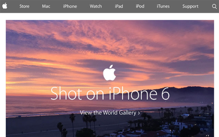
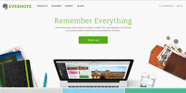
Yep, I did it. I used Apple as an example to illustrate my point. Easy way out? Absolutely. But the point is that simple, above-the-fold design with clear call-to-action works. Just like everything else Apple, the simplicity is by design from product to page.
6. Understanding and Leveraging Audience Site Behaviors
Answer these questions:
- What are the most visited pages on your site?
- Where do these site visitors most often go after their initial page visit?
- Is this where you want them to go?
If you’re unsure about how or why your site visitors navigate your site the way that they do, then it’s time to dig into the data. Simple plug-ins like KISSmetrics, Chartbeat, and your old trusty pal Google Analytics are just a few of the many tools available to hone in on why your visitors do what they do. Most importantly, why they don’t do what you want them to do.
If you use Google Analytics (GA), track the first and last pages of visitors as well as the average pages per visit. Next, identify where the exit points for the majority of your site visitors are – then fix these pain points.
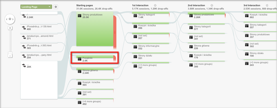
GA example from Mavenec.
You can also test exit-site behavior through tools that serve up a message to existing visitors through behavioral automation tools like bounceexchange to measure exit intent. Remember what good and bad exit pages are during this one: Lead Capture Form exit = bad. Thank You Page exit = Good!
Apply and test these simple upgrades to your site content and grow your email lists subscribers, social shares boost your ROI! Everyone wins!
[more]


