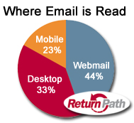
 Return Path’s recent research shows over 125% growth in accessing email via mobile devices in 2011. 77% of mobile email users check their email before they even get out of bed (I’m guilty of that one). On average, around 25% of email readers are viewing your emails at least once on their mobile device.
While email marketers are increasingly concerned about how their emails are prioritized in inboxes, the mobile factor has been sneakily increasing its impact. Mobile email readers generally perform “triage” (as IBM called it): they scan for senders and subject lines they need to open immediately and then they open certain emails to decide whether to read, scan or delete. Email rendering issues can be the difference between whether you’re email is read or deleted and chances are, you haven’t considered rendering issues your mobile users may be having.
It’s time. We email marketers have to start making our email marketing mobile-accessible.
4 Quick Tricks for Email Marketing Mobilization
Whether you’re a novice email crafter or an expert coder, here are 4 tips every email marketer can use to make your emails more mobile-optimized.
 Avoid stacking links – especially text links. Our thumbs are about 30×45 pixels and not always that accurate. Give at least a 10 pixel wide area around text links and make buttons large enough to avoid driving traffic to the wrong link.
- Think like a journalist. Shorten subject lines and keep the best bits in the first 4-5 words. Keep your articles to snippet-length and let readers click through for the full piece. (Bonus: this means you get to track what they read!)
- Images in your emails are automatically resized in various mobile devices in an attempt to make your email easier to read. Preview your email on a couple mobile devices for readability, for example, if there is any text embedded your image, is it still legible when it’s auto-sized?
- Use navigation links (like anchor links) to help readers on a small screen jump from a table of contents to their article of choice and back to the top. (Remember link spacing rule #1!)
BUT (big but), as our friends at ReturnPath say, “Don’t discount the desk!” Remember that – for most industries – the other 75% of your email readers are still sitting in front of a pretty big screen at their desktop. Test, test, test to be sure that your email design is performing the best it can for both mobile and desktop customers.
NOTE: Bossman David Cacioppo takes another popular stance in email creative design: design for mobile first. Meaning, design your emails for 300 pixels wide, especially if you know your audience checks most frequently via mobile, like our friends at Freelancers University.
State your side… Which do you think? Design with mobile in mind vs. design for mobile first?


