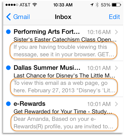
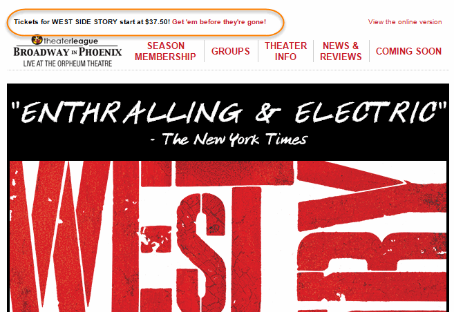
You've almost definitely seen the pre-header of an email before. It's the line or two of pure text above the graphic header banner in an email marketing message. Go ahead, check your inbox. You'll find something that looks like this:

Not every email has them, but they should! Ever wondered what they're for? Pre-headers have a few good uses. First, if images are turned off in the email, the pre-header ensures that your message can still be understood, without images, before your reader even has to scroll. The pre-header is also what shows up in mobile inboxes, next to the From Name and Subject line.

The gray lines in the above example are called the "snippet," showing the first lines of actual text in the body of your email. Snippets are used on iPhones, Android phones and even in Gmail's inbox. For "letter style" email campaigns, this first line is usually a "dear customer" opener.
 For promotional messages, you may see a lot of snippets that read "To view this email as a webpage, click here…" That's better than gobbledygook, which is what shows if there's no text above the first image. (The snippet is trying to read the code the shows the header image in your email).
But, as marketers, we can do a bit better than that.
An effective pre-header has 3 key elements:
- Start with a call to action, or the "2nd subject line." Because this is what shows in snippets, use this space to build on your subject line. Subject lines should usually be around 80 characters long. For mobile phones, you're more likely to only get 40 or so. Use the snippet to help support your subject line and entice an open. That means that starting with "If you can't read this email…" isn't your best use of that space. I've seen a great example recently that even includes the link to buy right in the pre-header! Talk about effective with images off…

- A view as a webpage link is still definitely a good idea! I don't mean to say you should leave this out. This will help those who have restrictive inbox settings see the full beauty of your email if they click through to view it as a webpage. It doesn't get too many clicks, but it's worth including. Plus, anyone who clicks that tells us that even though they didn't load images, they did, in fact, open/see the email, which helps our metrics be more accurate.
- Include a whitelist request, or "add us to your safe senders list" request. It's worded different ways, because different recipients may have to take different actions. For Outlook, recipients would select "Never block this sender." For Gmail and Hotmail, you'd want to request that readers add you to their Contacts list, making it more likely that you'll be delivered to the inbox.
How many emails in your inbox have all 3 things? Maybe not many… But the best usually do.
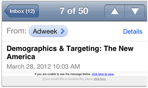
Notice a few things that I didn't include? Specifically, an unsubscribe request? A few email marketers will include an unsubscribe link in the pre-header to keep uninterested subscribers cleaned off the list with one click. The thinking is that it'll keep spam complaints low if it's easy to unsubscribe from the top of the email. I've had clients that have had success with this, almost entirely eliminating their complaints.
Here's the biggest reason not to add Unsubscribe to your pre-header:

In the inbox, this mice type might be pretty visible. And your mouse can almost definitely distinguish between which link it wants: click to view as a web page vs. click to unsubscribe. On a mobile device, this is an accidental unsubscribe waiting to happen. The links end up stacked directly on top of each other and extremely small. Big, clicking thumbs won't be great at distinguishing between the two!
So, now you know: the pre-header of your email is made up of a 2nd subject line (which becomes the snippet), a view as a webpage link and a whitelist request. Go forth and optimize!


